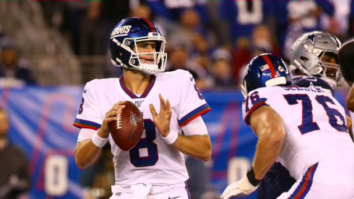
The Giants have some of the best colors in the NFL and they’re doing next to nothing with them. It’s time to switch up the uniforms.
Blue and red is an iconic color combination and we’ve seen so many great uniforms with this combo, so why are the New York Giants‘ uniforms so boring? I mean think about it, in the home jerseys the only trace of red they have is on the helmet and the NFL shield and on the road jerseys it’s the same thing, but with blue.
To be fair, the road jerseys have a little flare to them with the lines on the sleeves, but the home jerseys have quite literally nothing to them, just a royal blue jersey, white numbers, white logo under the NFL shield and white numbers on the sleeves as well.
What happened to the jerseys Lawrence Taylor wore? What happened to the red lining around the numbers on the home jerseys with the tri-stripe on the collar and sleeves alternating red, white, red and on the road jerseys the blue number with red lining and the tri-stripe on the collar and sleeves alternating blue, red, blue?
To be fair, the Giants’ color rush jerseys that they wear once a year is exactly like the throwback road jerseys, but why is this worn only once a season? In my opinion, that’s the best jersey in the Giants combination of three and yet fans only get to see it once a season.
The throwback modernized is a great look and we’re seeing plenty of teams around the NFL bringing it back. For example, look at the Buccaneers and Browns, they just changed their jerseys this offseason and all they did was modernize their throwbacks.
So if other teams can do it, why can’t the Giants? Think about how great the Giants’ color rush jersey looks, what if they made that the permanent road jersey and did the same thing with the throwback home jersey as well?
Personally, I think that would be a fantastic look because in doing so you utilize both of your colors, which isn’t the case with the current jerseys.
since a bunch of teams are getting new uniforms...
— _ (@ryandisdier) April 18, 2020
a nod to the past with eyes on the future#NYG pic.twitter.com/lAWoWE0O77
Here’s an example of what it might look like, made by Twitter user @RyanDisdier. Personally, I like how this looks but I’d like for it to be more a copy of the color rush in blue. The difference with this one is that the colored collar goes all the way down to the shield and there are two stripes on the sleeves rather than three.
More from New York Giants
- Caesars New York Promo Code: Win $250 Bonus GUARANTEED on ANY Bet!
- When will the New York Giants’ First Win Come?
- New York Giants Look Horrible in Loss to 49ers
- New York Giants to Play an Injured 49ers Team Sunday
- New York Giants: Breaking Down the Devonta Freeman Signing
The question with a uniform change like this becomes, what do you do with the helmet? Do you keep the current NY logo, or do you go with the theme of the throwbacks and add the Giants wording with the underline?
Overall, I think the Giants need to do a couple of things and change up the uniforms because right now, they have some of the most boring jerseys in the league whether Giants fans want to admit it or not. Now that’s not saying the Giants have the worst jerseys in the league, because that isn’t true, but they are rather boring if you really think about it.
That being said, I think it’s time to switch them up and modernizing the throwbacks is a great place to start.
